A menu holds a set of commands (user actions) that are normally hidden, and are accessible by a button, key, or gesture. Menu commands provide a means for performing operations and for navigating to other parts of your application or other applications. Menus are useful for freeing screen space, as an alternative to placing functionality and navigation, in buttons or other user controls in the content area of your application.
The Android system provides two types of menus you can use to provide functionality or navigation. Between them, you should be able to organize the functionality and navigation for your application. Briefly:
All but the simplest applications have menus. The system automatically lays the menus out and provides standard ways for users to access them. In this sense, they are familiar and dependable ways for users to access functionality across all applications. All menus are panels that "float" on top of the activity screen and are smaller than full screen, so that the application is still visible around its edges. This is a visual reminder that a menu is an intermediary operation that disappears once it's used.
Let's start out with a quick tour of the menus.
Note: Your menus and screens might not look like those shown in this document; they may vary from one version of Android or device to another.
The Options menu contains commands that apply globally across the current activity, or can start another activity. They do not apply to a selected item in the content (a Context menu does that).
On most devices, a user presses the MENU button to access the Options menu, as shown in the screenshot below. To close the menu, the user presses MENU again, or presses the BACK button. In fact, to cancel out of any menu, press the BACK button. (Pressing the MENU button or touching outside the menu also works.) Note that how to invoke this menu may be different on different devices.
Each activity activity has its own set of operations and therefore its own Options menu. An application with multiple activities would have a different Options menu for each activity.
For example, in the message list view of an email program, the Options menu might let you search the messages, compose a new message, refresh the list, or change the email settings. The compose view of an email program would have a different Options menu, such as adding a CC field, attaching a file, or discarding the message.

On some versions of Android, the user can display keyboard shortcuts in the icon menu by long pressing the MENU button — the text in the icon menu alternates between the command names and their keyboard shortcuts (if any).
A Context menu is similar to a right-click context menu in a desktop operating system. It is normally a shortcut that duplicates commands found elsewhere.
A user can touch & hold on content on the screen to access a Context menu (if one exists), as shown in the screenshot below. A Context menu is a list of menu items (commands) that can operate on the selected content. The command can either be part of the current activity, or the system can pass the selected content along to an operation in another activity (by way of an intent).
For example, in an email message list, a user can touch & hold on an email message to open a Context menu containing commands to read, archive, or delete the message.
A user can also touch & hold a location on the screen to access a Context menu. An example is when the user does touch & hold on a blank spot on the Home screen, a Context menu appears; selecting an item from that menu inserts an icon at that location.

In the above example, if the user performs touch & hold on the contact "Obi Wan Kenobi", a Context menu opens. The commands provided in this Context menu are the complete set of actions that can be performed on this contact.
A normal touch on an item in the content activates the most intuitive command for that selection — in this case, "View contact". We recommend that the most intuitive command also be listed as the first item in the Context menu. In this example, selecting the contact "Obi Wan Kenobi" runs the same command "View contact" that is listed at the top of the Context menu.
Also note, as shown in the following screenshot, the Context menu and the next screen both hold the same complete set of commands that can be performed on this contact. The Context menu displays the commands in a list, while the "View contact" activity splits them into various items in the Options menu, icon buttons and list items.
Because of this duplication, using the Context menu is considered a shortcut for going to the next screen and performing the operation there. Context menus are less discoverable than either buttons fixed on-screen or the Options menu. Many users never discover or use Context menus. It is for this reason that, for the most part, any command on a Context menu should also appear on the most intuitive operation's screen. As the next section explains, text operations, such as "Select text" might appear only on a Context menu. Also, rich applications, such as browsers, which themselves can contain web applications, may have commands on Context menus that are not available elsewhere.

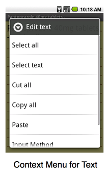
Text links and text fields in the content both have system-provided operations that are common across all applications: operations such as "Select all", "Select text", "Copy all", and "Add to dictionary". If the text field is editable, it also has other operations, such as "Cut all" and "Input Method", and if text is also on the clipboard, it has "Paste". The system automatically inserts the appropriate menu items into the Context menu of text links and text fields, as shown in the following screenshot.
An Options menu holds commands that are global to the activity while a Context menu holds commands that apply only to an item in the content. As shown in these diagrams, the user navigates to the menu, then touches a menu item to perform an action or open a dialog.

For more technical information on menus, see Creating Menus.
Commands can also be fixed directly on screen, typically in text buttons, graphic buttons, or list items. This placement is by far the most discoverable location for commands — a user can immediately see the command without having to first press a button. This increased visibility needs to be weighed against the space such user controls take up, or the sense that they might clutter the visual design.
Selecting the right kind of menu to present, and using menus consistently, are critical factors in good application design. The following guidelines should assist user experience designers and application developers toward this end.
Put any commands that are global to the current activity in the Options menu or place them fixed in an activity screen; put commands that apply to the current selection in the Context menu. (In any case, the command could either run as part of this activity or start another activity.)
You can determine in which menu to place a command by what it operates on: If the command acts on selected content (or a particular location) on the screen, put the command in the Context menu for that content. If the command acts on no specific content or location, put it in the Options menu. This separation of commands is enforced by the system in the following way. When you press the MENU button to display the Options menu, the selected content becomes unselected, and so cannot be operated on. For an explanation of why the content becomes unselected, see the article on Touch mode.
An example of a selection-specific Context menu is when a user performs a touch & hold on a person's name in a list view of a contacts application. The Context menu would typically contain commands "View contact", "Call contact", and "Edit contact".
Because of limited screen height, some menus may be scrollable, so it's important to place the most important commands so they can be viewed without scrolling. In the case of the Options menu, place the most frequently used operation on its icon menu; the user will have to select "More" to see the rest. It's also useful to place similar commands in the same location — for example, the Search icon might always be the first icon in the Options menu across several activities that offer search.
In a Context menu, the most intuitive command should be first, followed by commands in order of decreasing use, with the least used command at the bottom.
If a user can fully access your application without using Context menus, then it's designed properly! In general, if part of your application is inaccessible without using Context menus, then you need to duplicate those commands elsewhere.
Before opening a Context menu, it has no visual representation that identifies its presence (whereas the Options menu has the MENU button), and so is not particularly discoverable. Therefore, in general, a Context menu should duplicate commands found in the corresponding activity screen. For example, while it's useful to let the user call a phone number from a Context menu invoked by touch & hold on a name in a list of contacts, that operation should also be available by the user touching the phone number itself when viewing contact details. See shortcut for an illustration of this example.
As described under shortcut, touching on an item in the content should activate the same command as touching the first item in the Context menu. Both cases should be the most intuitive operation for that item.
In your application, when the user touches any actionable text (such as a link or list item) or image (such as a photo icon), execute the operation most likely to be desired by the user.
Some examples of primary operations:
Note that selecting the same item in different contexts might invoke different operations:
When a user does touch & hold on an item, the Context menu should
contain the name of the selected item. Therefore,
when creating a Context menu, be sure to include a title and the name of the
selected item so that it's clear to the user what the context is.
For example, if a user selects a contact "Joan of Arc", put that name in the
title of the Context menu (using
setHeaderTitle).
Likewise, a command to edit the contact should be called "Edit contact",
not just "Edit".
By putting commands in menus, you free up the screen to hold more content. On the other hand, fixing commands in the content area of an activity makes them more prominent and easy to use.
Here are a number of important reasons to place commands fixed on the activity screen:
If a text label in the Options icon menu is too long, the system truncates it in the middle. Thus, "Create Notification" is truncated to something like "Create…ication". You have no control over this truncation, so the best bet is to keep the text short. In some versions of Android, when the icon is highlighted by a navigation key (such as a trackball), the entire descriptive text may be shown as a marquee, where the words are readable as they scroll by.
When a dialog is displayed, pressing the MENU button should do nothing. This also holds true for activities that look like dialogs. A dialog box is recognizable by being smaller than full-screen, having zero to three buttons, is non-scrollable, and possibly a list of selectable items that can include checkboxes or radio buttons.
The rationale behind not having a menu is that when a dialog is displayed, the user is in the middle of a procedure and should not be allowed to start a new global task (which is what the Option menu provides).
When the user presses the MENU button, if there is no Options menu, the system currently does nothing. We recommend you do not perform any action (such as displaying a message). It's a better user experience for this behavior to be consistent across applications.
Sometimes a menu item's action cannot be performed — for example, the "Forward" button in a browser cannot work until after the "Back" button has been pressed. We recommend: