Menu icons are graphical elements placed in the options menu shown to users when they press the Menu button. They are drawn in a flat-front perspective and in greyscale. Elements in a menu icon must not be visualized in 3D or perspective.
As described in Providing Density-Specific Icon Sets, you should create separate icon sets for low-, medium-, and high-density screens. This ensures that your icons will display properly across the range of devices on which your application can be installed. See Tips for Designers for suggestions on how to work with multiple sets of icons.
Final art must be exported as a transparent PNG file. Do not include a background color.
Templates for creating icons in Adobe Photoshop are available in the Icon Templates Pack.
Caution: The style and content sizing of
menu icons have changed in Android 2.3 compared to
previous versions:
1. Icons have a larger safe frame; icon content is smaller within the full
asset. Final asset sizes have not changed.
2. The color palette is slightly lighter.
3. No outer glow effects are applied.
4. Menu icons can now be rendered on either dark or light backgrounds.
The following guidelines describe how to design menu icons for Android 2.3 (API Level 9) and later.
Menu icons can use a variety of shapes and forms and must be scaled and positioned inside the asset to create consistent visual weight with other icons.
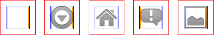
Figure 1 illustrates various ways of positioning the icon inside the asset. You should size the icons smaller than the actual bounds of the asset, to create a consistent visual weight. If your icon is square or nearly square, it should be scaled even smaller.
In order to indicate the recommended size for the icon, each example in Figure 1 includes three different guide rectangles:
|
|
|
|
|
|
|
Figure 1. Menu icon sizing and positioning inside the bounds of the icon asset. |
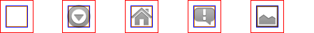
Menu icons are flat, pictured face on, and greyscale. A slight deboss and some other effects, which are shown below, are used to create depth. Menu icons should include rounded corners, but only when logically appropriate.
In order to maintain consistency, all menu icons must use the same color palette and effects, as shown in Figure 2.
|
Figure 2. Style, light and effects for menu icons. Note: all pixel dimensions are for medium density and should be scaled appropriately for other densities.
|
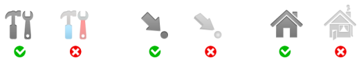
Below are some "do and don't" examples to consider when creating menu icons for your application.
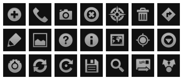
Shown below are standard high-density menu icons that are used in the Android platform.
Warning: Because these resources can change
between platform versions, you should not reference these icons using the
Android platform resource IDs (i.e. menu icons under
android.R.drawable). If you want to use any icons or other internal
drawable resources, you should store a local copy of those icons or drawables in
your application resources, then reference the local copy from your application
code. In that way, you can maintain control over the appearance of your icons,
even if the system's copy changes. Note that the grid below is not intended to
be complete.
The following guidelines describe how to design menu icons for Android 2.2 (API Level 4) and earlier. Menu icons in Android 2.2 and below are drawn in a flat-front perspective. Elements in a menu icon must not be visualized in 3D or perspective.
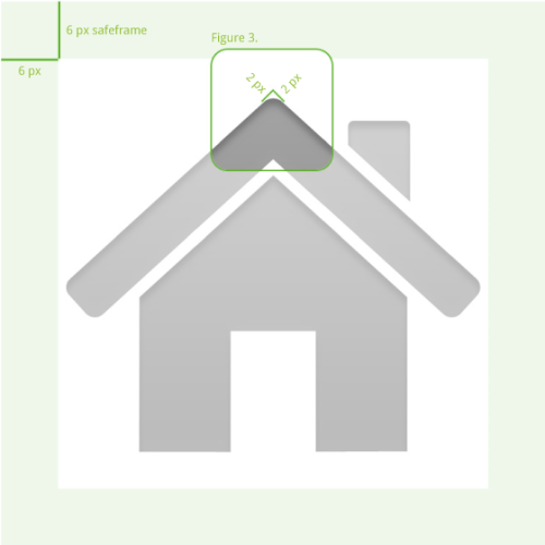
|
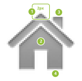
Figure 3. Safeframe and corner-rounding for menu icons. Icon size is 48x48. |
Menu icons are flat and pictured face on. A slight deboss and some other effects, which are shown below, are used to create depth.
|
Figure 4. Light, effects, and shadows for launcher icons.
|
Color palette
|
Step by step
|