Status bar icons are used to represent notifications from your application in the status bar.
As described in Providing Density-Specific Icon Sets, you should create separate icon sets for low-, medium-, and high-density screens. This ensures that your icons will display properly across the range of devices on which your application can be installed. See Tips for Designers for suggestions on how to work with multiple sets of icons.
Final art must be exported as a transparent PNG file. Do not include a background color.
Templates for creating icons in Adobe Photoshop are available in the Icon Templates Pack.
Warning:
The style and dimensions of status bar icons have changed drastically in
Android 2.3 compared to previous versions. To
provide support for all Android versions, developers should:
1. Place status bar icons for Android 2.3 and higher in the
drawable-hdpi-v9, drawable-mdpi-v9, and drawable-ldpi-v9 directories.
2. Place status bar icons for previous versions in
drawable-hdpi, drawable-mdpi, and drawable-ldpi directories.
The following guidelines describe how to design status bar icons for Android 2.3 (API Level 9) and later.
Status bar icons should use simple shapes and forms and those must be scaled and positioned inside the final asset.
Figure 1 illustrates various ways of positioning the icon inside the asset. You should size the icons smaller than the actual bounds of the asset. Status bar icons may vary in width, but only minimally.
In order to indicate the recommended size for the icon, each example in Figure 1 includes two different guide rectangles:
|
|
|
|
|
|
|
Figure 1. Status bar icon sizing and positioning inside the bounds of the icon asset. |
Status bar icons are flat, matte, and pictured face-on.
|
Figure 2. Style and effects for status icons. Note: all pixel dimensions are for medium density and should be scaled appropriately for other densities.
|
Below are some "do and don't" examples to consider when creating status bar icons for your application.
Shown below are standard high-density status bar icons that are used in the Android platform.
Warning: Because these resources can change
between platform versions, you should not reference these icons using the
Android platform resource IDs (i.e. status bar icons under
android.R.drawable). If you want to use any icons or other internal
drawable resources, you should store a local copy of those icons or drawables in
your application resources, then reference the local copy from your application
code. In that way, you can maintain control over the appearance of your icons,
even if the system's copy changes. Note that the grid below is not intended to
be complete.
The following guidelines describe how to design status bar icons for Android 2.2 (API Level 8) and earlier.
|
Figure 3. Safeframe and corner-rounding for status bar icons. Icon size is 25x25. |
Status bar icons are slightly debossed, high in contrast, and pictured face-on to enhance clarity at small sizes.
|
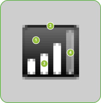
Figure 4. Light, effects, and shadows for status bar icons.
|
Color paletteOnly status bar icons related to the phone function use full color; all other status bar icons should remain monochromatic.
|
Step by step
|